Post Althusserian philosopher - yes another French one - Jacques Rancière has set art circles a-dancing by presenting his views on aesthetics and politics and various combinations of the two.
What has entertained me, which is relevant to my prisons project is the following quote taken from his work 'Dissensus' (I have highlighted the text):
Political dissensus is not a discussion between speaking people who would confront their interests and values. It is a conflict about who speaks and who does not speak, about what has to be heard as the voice of pain and what has to be heard as an argument on justice. And this is also what ‘class war’ means: not the conflict between groups which have opposite economic interests, but the conflict about what an ‘interest’ is, the struggle between those who set themselves as able to manage social interests and those who are supposed to be only able to reproduce their life.
In presenting my ideas of this, I have taken images of my computer screen as it presented a programme on the state of a prison in Northumberland,UK. It represents for me not only the state of this particular prison and those others experiencing similar problems, but it also represents that 'voice of pain' experienced by those prisoners who are not getting what they need during their time of incarceration.


A further experiment which also speaks to Ranciere's philosophy is the following:


Polaroid experiments: 05/05/2017


In this experiment, in playing with the physical Polaroid photograph, I am trying to create an 'otherness' - Foucault's heterotopia - of which 'prison' is an example, "something like counter-sites, a kind of effectively enacted utopia in which the real sites, all the other real sites that can be found within the culture, are simultaneously represented, contested, and inverted."(Foucault:'Of other spaces, Heterotopias') The rounded, geometric shapes formed when I pressed the mouthpiece of my inhaler on the developing Polaroid. In trying to get to grips with which movement I am using for my CS, I am deconstructing & degrading things photographical. This series is looking at deconstructing Polaroids in order to arrive at that 'otherness'.


An experiment in PS with presentation of the work in grid format and with different adjustments: in copper sepia and in monochrome to see what effects they would create. I favour the monochrome because the copper sepia seems too contrived. I shall experiment with putting space around each image.
The thinking behind these looks at decommissioned prisons in general and cells in particular as silent witnesses to suffering, or 'the voice of pain' in Rancière's Dissensus, now used as entertainment. The writing ( projected prisoner's letters ) on the walls references the monumental work of Jenny Holzer.
5th August, 2017
Pixel dragging experiments in Photoshop:
On the FB OCA page fellow student Holly Woodward has been posting images with bar-code-like alterations to her images. These reminded me of the pixellations on my Panorama series above so I asked her how she did it & I received a Youtube link to https://www.youtube.com/watch?v=U3oOb7UXMcs which tells you about pixel stretching.
The main PS tool is in the marquee tool range. Not happy to stay at a single line, vertical or horizontal, I tried to incorporate the square & oval tools and then tried the Extrude filter option in PS too.


By the second image, I was hooked:


At this point another student Rob, suggested MOSH: https://getmosh.io
and from the original on the left, the image on the right emerged:
I am trying to see if I can replicate the effects, created by a technological mistake on the original Panorama programme.


HMP Dartmoor series
Bodmin Jail (Closed 1926)


HMP Shepton Mallet visits cubicle.

Pixels taken to their limit.
1st January, 2018
Tutor Wendy's feedback to Assignment 3 was
1. to 'develop' the series of images.
Going into dilapidated former prisons has given me several ideas of what to get but going back over and over again has provided me with all the images I am likely to get. Having made a breakthrough regarding the inscription over the entrance to Dartmoor prison, Parcere Subjectis' (take care of the vanquished) tells me I want to depict how prisoners are, in fact, looked after rather than portray the 'abandon all hope ye who enter here', the inscription to Dante's Hell which, given the mass media coverage of UK prisons to date, is what most people would deduce .
After a second Skype discussion:
2. to explore the concept of 'time'. (See also my blog of 27/12/2017) and to play with size and scale.
In June I collected some Handkerchief tree bracts and put them in a magazine to dry. They are now still cold to the touch and flexible but delicate. I took images of the bracts dropping in front of a black backdrop and had two sets of images: images in which the bract was stationary, and those in which I caught the bract moving which I particularly like. The significance of the project is that the life inside prison is much like that outside in that there are periods of movement and periods of stasis; the main difference is that in prison, these periods are imposed rather than chosen by the subject. The significance of the bractis that, being brown, it represents the changing of the seasons and therefore time. Time is of prime importance for prisoners both from the perspective of their sentence and the time they have on their hands while inside.
Having played around with these, I arrived at 2 arrangements which give the impression of stasis and movement:
Considering the first one too dark and therefore giving a sinister connotation, I inverted the colours but then reverted to the original in respect of the individual bracts, but this connotes the constant surveillance which was not in my original idea:
On the OCA Photography Discussion Forum, there was a question of the value of square format landscape images. Amid the inevitable technical discussion, tutor Peter Haveland commented on the strengths of landscape and portrait orientation images:
"One needs to think about what the different formats imply. An oblong perched on its short end (portrait) is inherently unstable and so more dynamic, emphasising verticals over horizontals siuting a living subject…resting on its long side (landscape) it is super stable suggesting stasis and longevity emphasising horizontals over verticals…a square format is stable but favours neither horizontal nor vertical. How you compose in each of the formats is entirely different and what each conveys is also very different."
Because I had composed a very static composition in portrait orientation, I asked if the stasis I wanted to convey in my arrangement is compromised by the orientation. To which Peter replied:
"You are adding another element here aren’t you?
Centre of gravity (or centre of mass if you prefer) is the thing here…a tall thing with all the weight at the bottom is very stable (think of a fishing float or that old children’s toy, a Kelly).
Also, we can use expectations to subvert them."
So I decided I wanted to be subversive and suggested these orientations to test how people perceive the image:
Since some of my images are in square format, I thought I would experiment. In the mean time, I also came across, on my computer reading list, an artist I had investigated ages ago, Paolo Ventura. I love his pixelated paintings and thought I would adapt the idea to my experiments.
Before my exchange of ideas on OCA Discuss,I had tried this using random pixellated bits:
After the exchange I tried this:
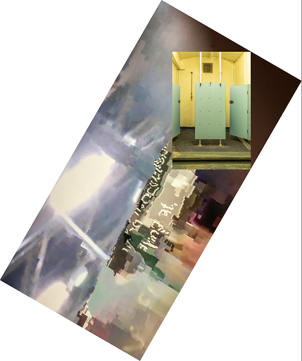
I then tried the pixellated idea drawing on my original, corrupted Panorama film captures and adding my subsequent prison images:
Although I find the images quite exciting and feel that that is an idea I would like to take forward, I realised that I had not, after all, subverted the conventions because my creative default setting is to create a balanced image, and that not only are the images in square format so inherently balanced anyway, but I have added a figure to prop up the squares should they topple over!
So here is the next attempt:


2nd January, 2018
Picking up from yesterday's experiments and having slept on the concept of subverting our expectations while keeping Rancière's thought on "It is a conflict about who speaks and who does not speak, about what has to be heard as the voice of pain and what has to be heard as an argument on justice" (See top of 'Experiments' page):
The orientation is 30 degrees off vertical, which follows no expected standards like 45 degrees to vertical; in the written text there is a hint of the voices heard - whose are they? The image I wanted to show here is off-centre making the whole image unbalanced. Does it work? The order emphasised by the metal cage elements is at odds with the anarchy of the rest of the image, which I like.
Same orientation, different combination of images: the corrupted Panorama film images still constitute the background , or base image as that is the type of media coverage prisons get. Aesthetically, I find them intriguing:


At Catherine's suggestion, I have smudged the edges of the prison images in order to blur the separation of the different realities.
Unexpectedly, they seem to insinuate themselves more into the image than I was expecting.

The superimposed image seems to burrow into the one beneath it giving it a 3D effect.