4 of 4:
Torre Abbey Museum: Face to Face
Wit two other OCA photography students, I visited the Torre Abbey exhibition the apt subtitle of which "From Paint to Pixels", explains both the context and the scope of the exhibitions. I appreciated the inclusion of work done by local schools but I thought that the curator, Beth Hughes, missed an opportunity when she placed the schools' projects around the lift shaft walls rather than including them in the main exhibition halls. Would placing them with the others have diminished the value of the masterpieces and contemporary photography?
The images I enjoyed most were those of Sara Lucas and Chris Killip.


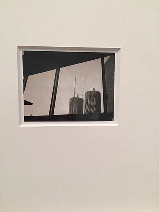
I enjoyed the Killip 'Man, Whitley Bay' 1975, because, in contrast to all the other paintings in the room dedicated to seascapes, this one reflected a serene relationship between the man and the sea: there were no overt battles being fought, no work, no building: the man is at peace with the sea an impression enhanced by the horizontal lines, balanced by the verticals, if there were any battles, they are behind him.
The Lucas images reflect a quirky humorous angle, particularly the 'Self portrait with knickers' 1994.
One of their prize exhibits, ' Turner Prize winning (2007) British artist; Mark Wallinger is best known for his sculpture ‘Really Good’ for the empty fourth plinth at Trafalgar Square. Face2Face will feature his work Angel (1997), a seven and a half minute video in reverse featuring Wallinger playing Blind Faith, his sightless alter ego.' made an excellent talking point because it made you wonder how it was made, rather than what it was saying.
I don't know yet if there is anything I can take away about the works or how they would influence my work.
What was unique about this exhibition was how the individual items were slotted in with the museum pieces underlining the fact that the museum only has conventional museum paintings, drawings and sculptures with a few interactive exhibits. Will it acquire photographic items as part of its permanent collection?
I had seen the flyers advertising the event with the photographers involved and I was very disappointed to see that two artists whose work I really wanted to see, Tillmans and Whiteread, were not there.
No. 3 of 4
Gregory Crewdson "Cathedral of the Pines" exhibition at
The Photographers' Gallery, London.
Reversals: Gregory Crewdson's sense of time : an essay by Alexander Nemerov
I found this essay captivating because it plaited together American social history, art and literature, and Crewdson's seeming awareness of them all in his work "Cathedral of the Pines".
Although there are many more strands than these in the essay, the aspects that struck me were the parallel experiences of the characters in the photographic tableaux and the characters in American Indian history as seen in art tableaux.
Nemerov writes of the Crewdson characters that what happened in history was of no concern to the characters 'in the privacy of (their) misfortune' and that 'the key to the past is place.' I shall use these two concepts in my prison project as the crucial factors in any prisoner's experience are time and place.
Nemerov asks of the Crewdson characters "Do they need a history lesson to follow their own sorrow? Do they not continue to live in the Now of their mysterious disappointment? Or is somehow the history of this place - lesson or not - a matter of deep consequence to them and to Crewdson?'
A further crucial point:" Nakedness is the sign of squalor and abjection, the stripping of the settlers' pretence to decency, order, and godliness." To what extent does this apply to prisoners in general and to my correspondent in particular?
"A backstory of guilt and vulnerability and pain and dejection - with always the possibility of being redeemed ... gives Crewdson's work its emotional depth." Again, can I bring this out in my narrative?
"Each intensity of suffering, separate and irreducible, joins with others to make a palimpsest of time in one place." My Polaroids attempt to reproduce that scraping away at my prejudice over a lifetime of ignorance.
"The Cathedral is still there but it is empty - the congregation departed - and nature, ravenous and entwining, grows to fill halls. " The empty, crumbling prisons taken over by nature.
"The arms of overmastering trees twist with the energies not just of their minds but of a universe in which they are strangers."
"Struck dumb in a soundless world ... a light-bathed host of mortals struck to saintliness by their sad defiance of time ..." - superb descriptions of the characters in the Crewdson tableaux.
No. 2 of 4:
Bath Spa degree show.
Coloured floor tracks should have led us to the photography area but we got diverted en route to see all sorts of artistic expressions.
The rest of this is on the blog on the Home page.

No.1 of 4:
Review of "Ken. To be destroyed." by Sara Davidmann at the London College of Communication, London, UK.


The letter in the black room and the detail of how it was tacked to the wall.


The floor to ceiling display of the main image manipulation by Davidmann..

6th January, 2018
"Inspired by granite" 13 artists' response to granite elements.
The Dartmoor Park Visitors' Centre, Princetown, Devon.
Multi-media exhibition covering photography, creative writing, ceramics, textiles, film making, print making, painting, cyanotypes and sculpture.
Having missed the opening hours by 10 minutes on Friday, I went back bright and early on Sunday. The exhibition had been recommended by a former OCA photography student who thought I would like it.
I had no preconceptions and was stunned to see how such a diverse exhibition could be curated.
Curator: I suspect it was the project leader, Bridget Arnold
Pros and cons of the space: Pros: Compact and easy to negotiate. Con: The signage in the room was inconsistent: some exhibits had the work info next to it and some didn't; some of the panels had the info on the artist and some didn't. There was a central ring binder with all the info but it was tied to a bar near the screen; when I asked for the press releases, I was told there was a catalogue which was produced from somewhere.
My highlights:
I really liked the cyanotype crepe de chine scarves- particularly as it was a 'granite inspired' piece - the juxtaposition of the elements appealed to me. The cyanotypes on paper by the same artist, Bridget Arnold, were excellent in their delicate effects
The ceramic work by Angela Holmes was very original in its interpretation of the theme:
All these local women artists worked on a theme for two years exploring their relationship with granite on Dartmoor in particular. The range of ideas is mesmerising and, in a way, replicates our OCA SW meeting groups, how we all develop our skills and projects and share them with one another either at the meetings or at our end of year exhibition. We are not the only ones touched, in some way, by our artistic practices, some of the the visitors, most of whom we do not know, will be inspired somehow by our explorations. Although we are not working on a common theme like 'granite', our theme is to explore our medium to the best of our ability and, perhaps, help or be helped by others in the group.
What I took away with my about the work:
It was inspiring to see so much excellence. I have always wanted to try print making & this made my mind up that when I have finished my degree project, I am going to do a course on it. I think it is the tactile quality of this work by Anita Reynolds which invites you to touch it (I didn't!) that convinced me to try. The lines are so important, as they are in granite.
What I took away from the exhibition about me & my work:
I am a tactile person: I want my photographs to have a 3rd dimension because to me they are absolutely NOT flat objects: they have a depth, both physical and metaphorical; they have a physical place in the world; they represent the layers with which we see the world.
It was interesting to see that, in the exhibition information ring binder, some of the artists inserted extracts from their sketchbooks.
Next steps:
Finish my BoW & CS and then think about print making!


2018, January 16th & 17th: London
Two days of gallery visits
The Photographers' Gallery:
Wim Wenders Polaroids: Instant stories.
Curated by TPG & the Wim Wenders Foundation
I had gone with the preconception that this exhibition was just going to be one man's stories with Polaroids - so what?
What struck me first that the space each Polaroid was given allowed it to exist in its own right. The second was that I appreciated Wenders' sense of humour:
As I was walking round the exhibition, I was constantly distracted by the random noises of the looped videos he had running. When I stopped to look at them I was gradually taken in by the irregular rhythm they expressed, punctuating the fact that there was no reason to be making the images except the 'recklessness' (Wenders word) of taking them. I shall certainly be thinking of those when I work on my final piece for my BoW submission.


The Photographers' Gallery: 16/01/2018
4 Saints in 3 acts: a snapshot of the American avant-garde
Curators: Patricia Allmer and John Sears.
It is a photographic record of the American avant-garde opera. the librettist was Gertrude Stein and the score was written by Virgil Thompson. It was the first opera to be performed by an all African-American cast.
The only photographer I knew was Lee Miller.
As I am not much into opera and I did not know any of the actors and only 1 of the myriad photographers, I saw these as records of the event and very valuable as that.

Eva Jesse, choral conductor
by Lee Miller

The Photographers' Gallery: 16/01/2018.
As someone who has spent nearly 40 years in teaching, I could relate to aspects of "Indeterminate Objects (Classrooms)" by Wendy McMurdo on the media wall.
What I could relate to was the dreamy aspect of the digital geometric forms inspired by software such as Minecraft. I could see in it mesmerised children whose imaginations get transported by things that they learn.
The juxtaposition of 21st century digital expression in a 19th century building with all the familiar classroom furniture was very effective. It must have taken hours to do. The shadows were there just to make the digital mobiles look real and so their absence in some of the tableaux brought me back to the realisation that they were part of the virtual reality expression.
The London Art Fair, 2018
When Catherine Banks invited me to the London Art Fair in January, I jumped at the opportunity as I had never been before. As soon as we stepped into the vast hangar of the space the enormity of what we were to see did not hit me until 4 hours later & we decided to call it a day not having seen everything.
Six artists made a huge impression on me:
Nemo Nonnenmacher
A recent MA graduate of the Royal College of Art, Nonnenmacher explores the relationship between the virtual and the real via 'digital texture'. His work touches on the 3D and virtual figures which give his work an enviable cohesion despite the individual works being so disparate.
Freddy Fabris
The depth of field and textures give his work a strong haptic feel, while the story telling evident in his work is reminiscent of the old Dutch masters and reflect an ambiguity between modern and classical traditions. I would love to be able to produce such images. His work also makes me laugh and his prices makes my eyes water.
Lu Jun
Lu Jun won the 2009 Florence Biennale Gold Prize in Photography. He blends genres, starting from China's well-known traditional landscape painting, and using contemporary digital ink and wash techniques.Lu Jun photographs the paths of ink in water with a camera and then blends strands for different layers to form a new image. The ink therefore becomes the subject, the medium and the message.
Rosie Emerson
Since my study day on cyanotypes with tutor Russell Squires last July, I have wanted to learn more about Rosie Emerson's work as it goes beyond any cyanotypes that I have ever seen. The gradual fading and textures in her work are second to none and her combinations of cyanotype with prints and colours added in post production are really inspiring for me.
From her website: " Interested in surface, the interplay between photography and painting. Emerson’s works are playful constructs; Photography is used, not as a device for capturing reality but for creating romanticised optical illusions. "
Kristian Evju
The first body of work which stopped me in my tracks was that of this Norwegian artist who sees his work as an assemblage of conversations in which the participants are frozen in a state of uncertainty; he leaves it to the viewer to take his/her own meaning from the image. His surreal drawings and paintings are a mixture of portrait and symbols of a different time. his characters seem to enact a narrative without a script. He writes:"I am fascinated by the unique way we consciously filter and gather visual material on a daily basis. My drawings and paintings serve as a meticulous documentation of this intuitive filtering on a personal level. I want my work to reflect unmistakable qualities from the photographic source material, but at the same time I strive to protect the qualities of the materials I work with - graphite and paint."
Neville Gabie 'Experiments in black and white'
This is probably the work which, of all the work that I saw, most captivated me both by its expression and its origins.
It concerns community primarily. In 2012 Gabie was invited to spend a year with the Cabot Institute, the University of Bristol's cross-disciplinary centre which conducts world-leading research on "the challenges arising from how we live with, depend on and affect our planet." Focusing on major issues at the centre of "the human-planetary relationship"such as food, water and environmental change, the Institute brings together academics from a wide range of disciplines in the hope of creating new, potentially radical ideas and solutions. Gabie created a 'common room' - a conceptual space where he invited people to bring something in their own specific area of interest: an object, a concept, an equation, an image.
From all this he developed a collaborative project entitled Archiving Oil and for that he made studio-based films which consider 3 materials: oil, chalk and glacier ice. Gabie originally trained as a sculptor so manipulation and materiality had always intrigued him.
Experiments in Black and White is both a performance and a final work. In the performance, the artist, dressed in a black suit and a white shirt, takes a large bolder of chalk and scrapes it methodically and repeatedly along a black wall. His actions are laboured from the weight and unwieldiness of the chalk fragment. The work is made up of repetitive actions and cracking sounds. Progressively he becomes coated in chalk and the resultant drawn lines seem to form waves of water rather than rock strata.
The chalk drawing left in the gallery as well as his chalked suit and chips of chalk left on the floor become reflections on manual labour, on early mark making as children, on the nature of the material and the role of the artist.
I would really like to work collaboratively with a cross-disciplinary group to reflect something about our social communities, something which would involve creative writing, performance, photography, textiles and printmaking. But I don't know how, in what context or for what end. Need I worry about the end?
Thanks, Catherine, it was a great day out!


Mike Perry Land / Sea (Air / Môr) at the Plymouth Arts Centre April, 2017.
In this exhibition Perry wants to see how material culture, objects and the landscape affect each other, much like archaeologists examine artefacts to see how people lived.
Perry has a deep concern with the relationship between humans and the environment. His work combines two bodies of work: Mor Plastig and Wet Deserts.
the latter is a group of photographs of Britain's upland moors and mountains. Essentially vistas of 18th C landscape paintings and Romantic poetry, the kind of places that shaped Edmund Burke's thinking in his 1757 essay "Philosophical enquiry into the Origins of Our Ideas of the Sublime and the Beautiful". Perry questions that Romanticism in the face of an industrialised island.
Môr Plastig - Welsh for Plastic Sea, is what fascinated me as far as its display and presentation was concerned. It was presented in a grid, a classification of the objects found washed up on the Pembrokeshire coast: Shoes, Grids, abstract configurations of plastics and rocks. This resembled an 18th C study in taxonomy. The images are presented floating on the page, divorced from their contexts inviting a close study of the materials and the surface.
The shoes came from all over the world referencing perhaps the colonial expansion and the expansion of scientific knowledge closely bound up with the spread of Empire. The beauty of the individual images belying the catastrophic repercussions of the widespread use of plastic which eventually finds its way into the sea which reclaims it in its own way.
This for me was the highlight of all the exhibitions I saw in 2017. There was a film showing how Perry had collected and photographed the objects using natural light in his studio yet his images had a distinct 3D quality to them which I admired greatly & this is something I want to take into my own work.


